| PART I: YOUR FACE | |
| Step 07: Adding Color |
|
| PART I: YOUR FACE | |
| Step 07: Adding Color |
|
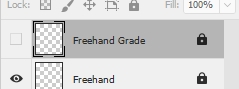
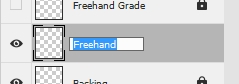
Before we can start adding color, we need to make some adjustments to the layers we currently have. First, we need to get the lines we drew on our Freehand layer onto our Cartoon layer so that any areas we need to fill with color will be enclosed. We can't just simply merge the two together as that would destroy the Freehand layer and we need it to grade your work from Step 06. Instead, we need to make a copy of our Freehand layer so that we have an extra version of it to merge with the Cartoon layer.
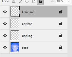
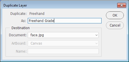
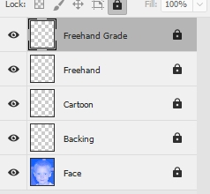
Notice that the Freehand Grade layer is automatically locked (can you explain why?). This is good - you should not edit this layer at all for the rest of this project. Since this layer will only be used for grading, we can turn its visibility off and never touch it again.
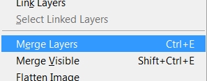
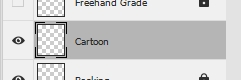
Now let's merge the Freehand (NOT Freehand Grade) and Cartoon layers together. There are several ways to pull this off, so let's do it using one of the most common methods.
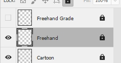

Photoshop named the new merged layer Freehand because that was the name of the layer on top of the layers that we merged. Let's rename the layer back to Cartoon.
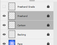
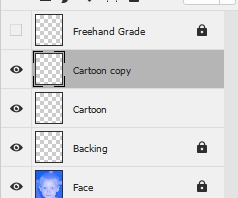
We next need to make the lines in our Cartoon layer just a bit darker and more defined then they are right now. To do this, we will simply make a copy of the current Cartoon layer and merge the copy with the original. This will give us lines with more color and depth without us having to work with a really heavy brush back in Step 05.
Color time! We are going to be using the Color Picker to change colors, so let's take a quick moment to get a look at it...
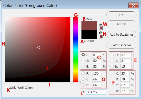
Above is the Color Picker. When you click on the foreground or background color box (shown in the direction below), the Color Picker comes up to allow you to select a new color. Let's have a look at its various parts (the letters below correspond to the letters in the above graphic).
| A. | This indicates the current or starting color - in this case black was already selected as the Foreground color (the color box above the word 'current') |
| B. | This box will give you a preview of the new color you have created (the color box below the word 'new') |
| C. | These options allow you to set specific amounts for HSB (Hue/Saturation/Brightness) ● Hue is simply another word for color ● Saturation indicates how vivid the color is ● Brightness controls how light or dark the color is |
| D. | These options allow you to set specific amounts for RGB (Red, Green, Blue) |
| E. | These options allow you to set specific amounts for Lab (Luminance/a/b) - Lab tries to approximate the colors seen by the human eye and is a great system to use when converting colors from RGB (computer display) to CMYK (print) because it actually includes more total colors than both RGB and CMYK |
| F. | These options allow you to set specific amounts for CMYK (Cyan, Magenta, Yellow, Black) |
At this point you may notice that the CMYK options do not have radio buttons (the little circles) in front of them like the rest of the options. This is because the Color Picker is designed to work with only three different color channels and CMYK has four. However, this is not a problem. If you wish to change colors using CMYK you can simply type a value in for each option or click in the Color Field (J).
| G, H, & I. | These three areas are related - when you click one of the radio buttons, the various color possibilities for that option are displayed in G - the Vertical Color Slider (in the image above the radio button in front of H is selected and so Photoshop is displaying the possible Hue color choices) and the various color possibilities for the other two choices are displayed along the edges of H and I (with the radio button in front of H selected in the graphic above, the S set of colors are displayed along the edge in H and the B set of colors are displayed along the edge in I) |
| J. | This is the Color Field where you can simply click to select a color and have all of the color options fill in with that color's values |
| K. | Checking this will limit your color choices to colors that can be displayed by a Web browser - we will not be needing this for our work in Photoshop |
| L. | This displays the hexadecimal code for the selected color - this code is mainly for working with colors on the Internet, so we will not be using this |
| M. | The triangle is a warning that the currently selected color is outside the range of available colors for printing - clicking the tiny color box below the triangle will convert the currently selected color to the nearest color that can be printed (this is only seen if you select a color that can not be printed) |
| N. | The cube is a warning that the currently selected color is outside the range of available colors for display on a Web page - clicking the tiny color box below the cube will convert the currently selected color to the nearest color that can be displayed on a Web page (this is only seen if you select a color that can not be displayed on a Web page) |
The most common way to use the Color Picker is to have the H radio button selected, but as you can see it has many other possible configurations.
Let's get a color to work with...
| A Quick word of warning at this point: DO NOT choose solid black as one of your fill colors. If you do, it will simply merge with the color of your outline and your outline will be lost. This will cost you points. One of the important parts of creating a cartoon version of yourself is having an outline that is distinct from the fill color. If you want something to be black, simply choose a color that is dark, but not totally black. |
Remember when using the Color Picker that you can drag the vertical color slider (the tiny pair of white triangles indicated below...)
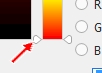
up and down the vertical color bar to change the color in the Color Field (when you move one slider the other one moves with it automatically).
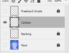

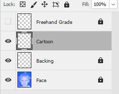
Take a second now to make certain that you are adding color to the Cartoon layer - the other layers should be locked. If you are not on the Cartoon layer then you will have to start over.
A quick piece of advice here: if your face color spilled outside your face...
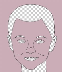
then you have most likely missed a gap in your line somewhere so that the area of your face is not completely enclosed. It's a little bit like trying to put bacon in a bag with a hole in it - bacon will spill out of the whole and fall on the floor ruining perfectly good, delicious bacon. Simply undo the fill (Ctrl+Z) and zoom in on your line and find your gap (which, by the way, you should have found in Step 06). Use the Brush Tool to fix your line and then retry your color fill.
While everything looks good when we are zoomed out, when we zoom in we notice a tiny issue with our line...
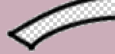
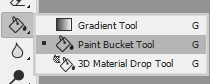
The clear 'shadow' you see around your line is there because you clicked on a transparent pixel with Contiguous checked on the Paint Bucket Tool's Options Bar. The Contiguous option causes all pixels similar to the one you clicked on to fill with the selected color. In other words, when we clicked on a transparent area, Photoshop was only able to fill color into truly empty or transparent pixels. Our lines are actually surrounded by light black and gray pixels that gradually fade into transparency. While it may look at this point like we have a real problem on our hands, it is actually no big deal (and in fact, we want this to happen at this point) and we will fix this problem in Step 08. For now, ignore the 'shadow' around your lines.
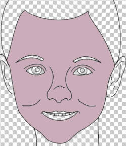
Once everything is filled you should have a face similar to the one below...
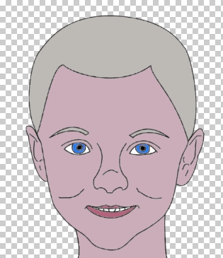
Again, notice that our black outline is not perfect (look closely at the eyes and mouth in the image above). The last thing we will do with our face is fix the problem with our lines.
01 | 02 | 03 | 04 | 05 | 06 | 07 | 08 | 09 | 10 | 11 | 12 | 13 | 14 | 15 | 16 | 17 | 18 | 19 | 20